Week 4! - Medical School and 2010 U.S Population DataVis
:) Using HTML + D3.js +Chart.js
Datasets
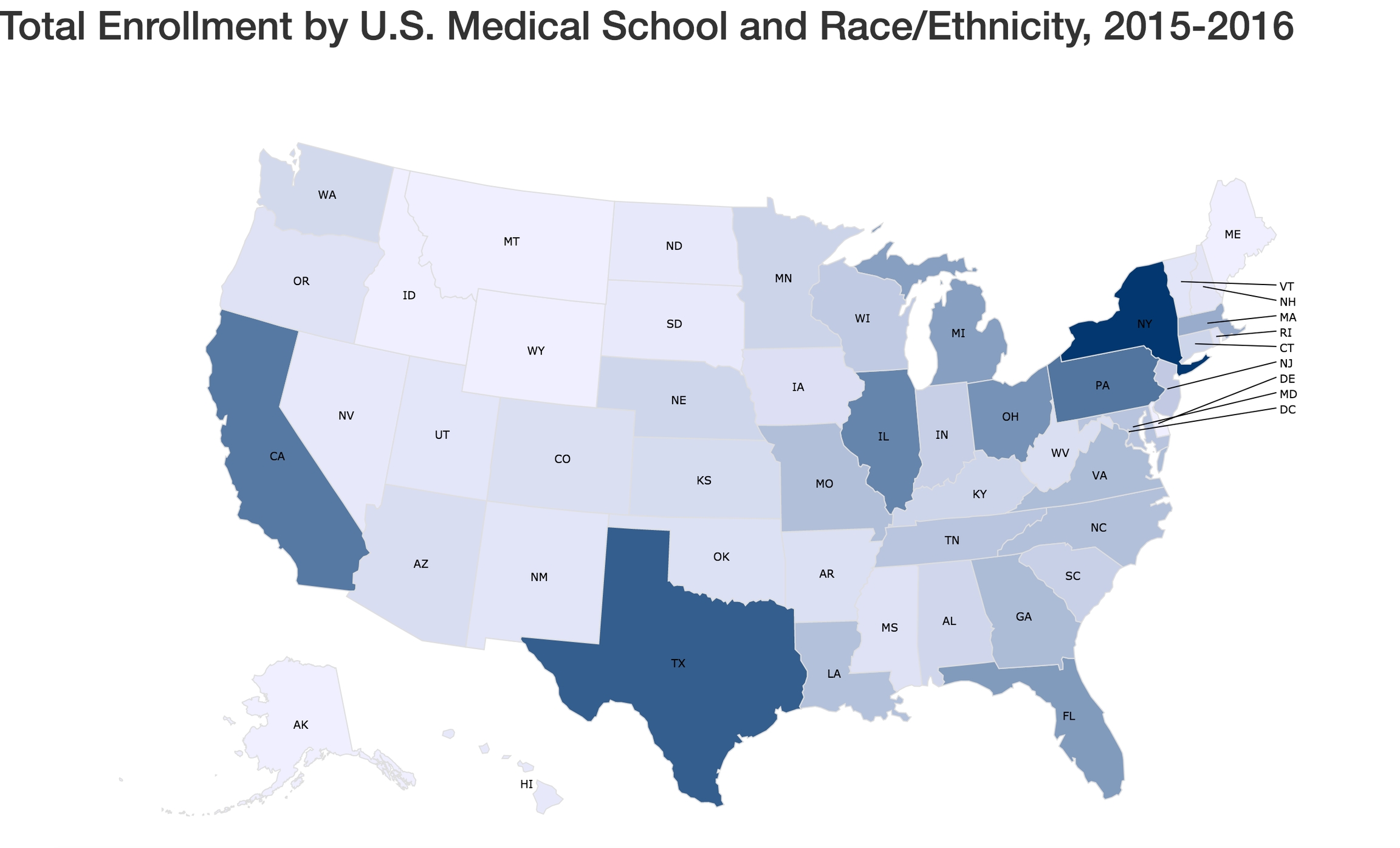
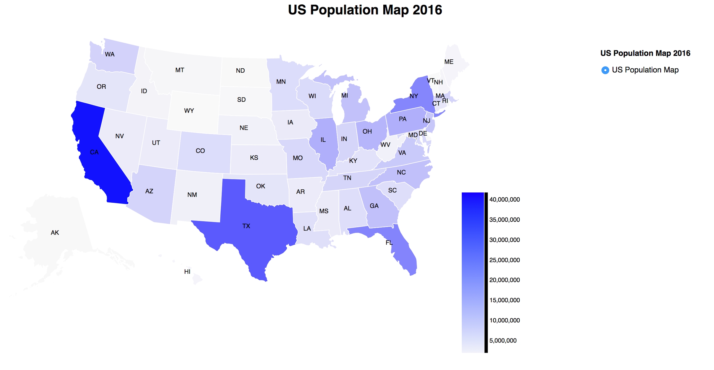
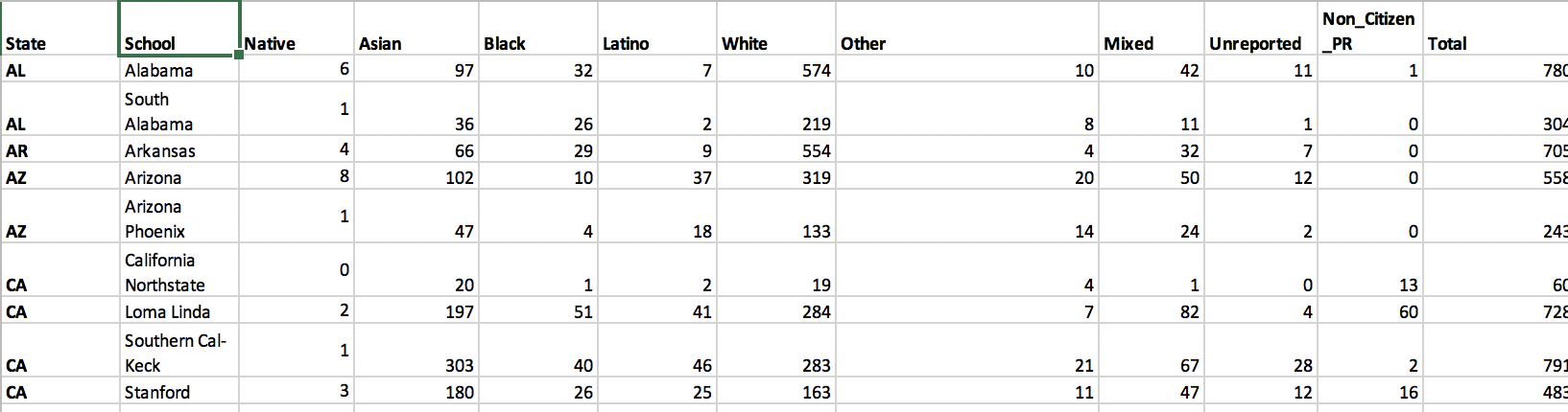
I used two set of datasets: US Census Population dataset and Total Enrollment by U.S. Medical School and Race/Ethnicity, 2015-2016 dataset.
US Population Map
http://www.byteyoo.com/DataVis/ - US Population Map Dataset (Census) https://www.census.gov/data/datasets/2017/demo/popest/state-total.html.
AND
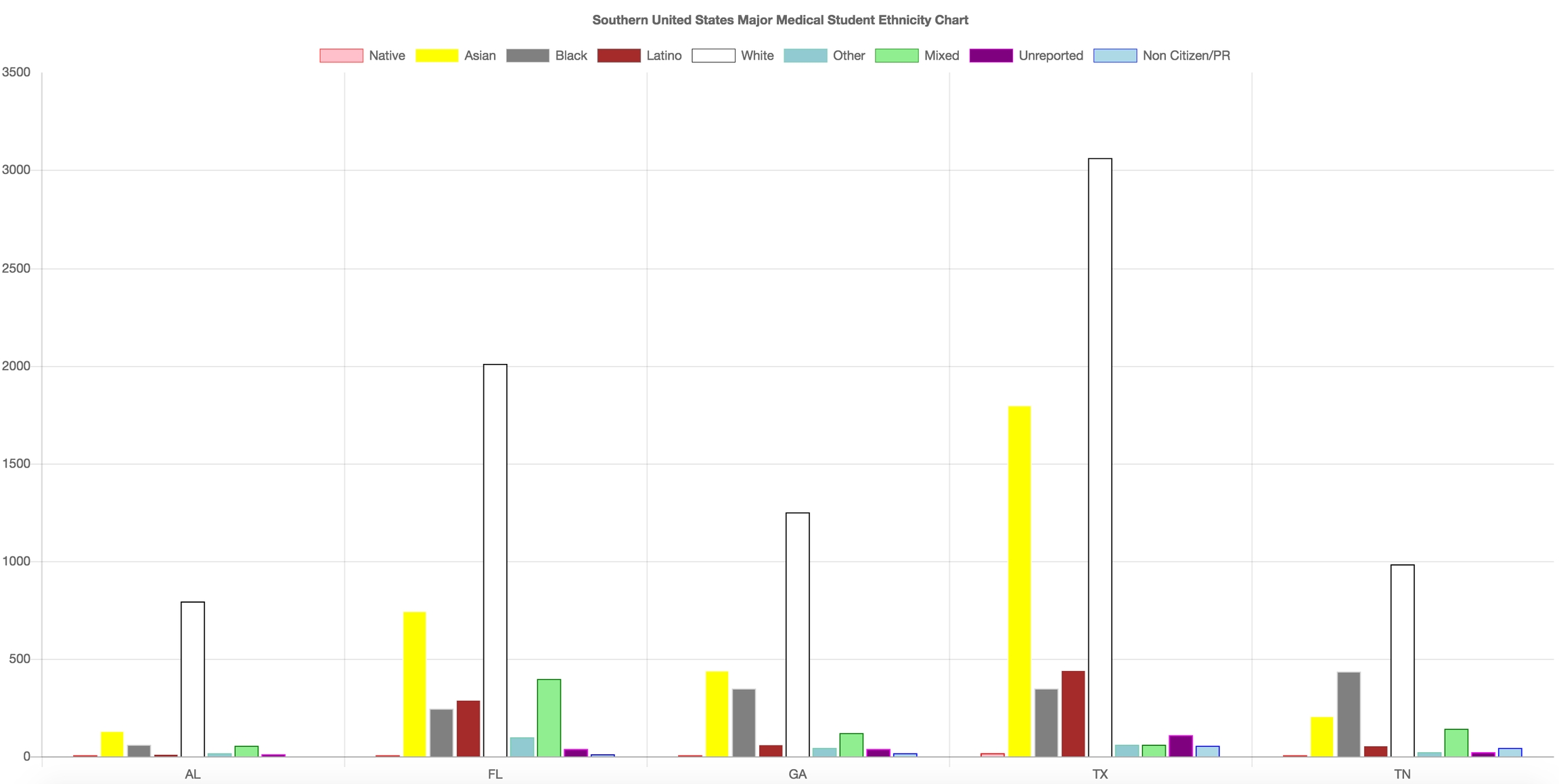
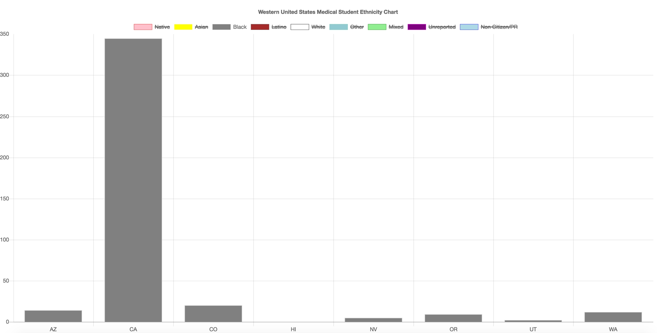
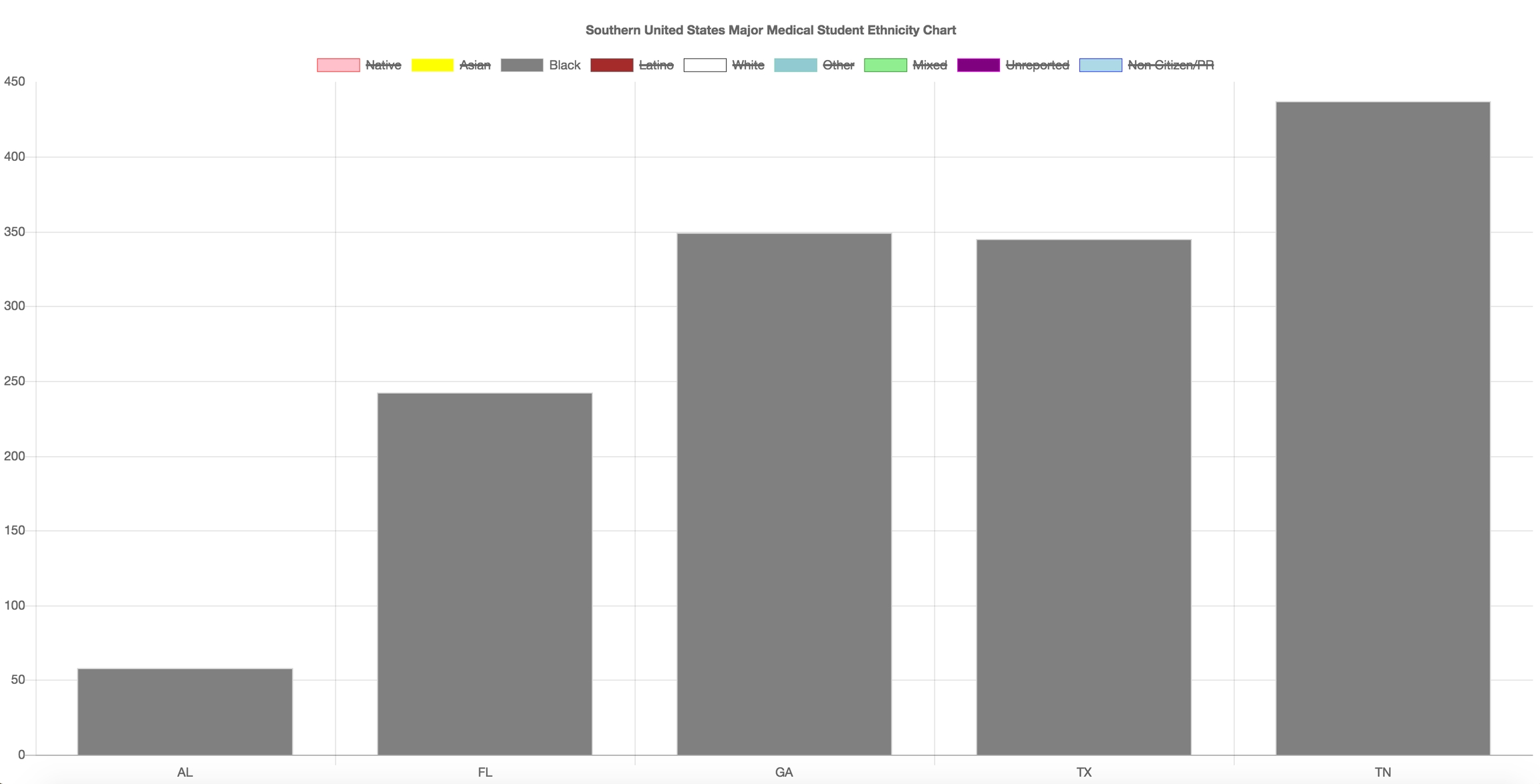
Western US and Southern US
http://byteyoo.com/DataVis/Medical/ - Total Enrollment by U.S. Medical School and Race/Ethnicity, 2015-2016 (Western US)
http://byteyoo.com/DataVis/Medical/southern.html (Southern Major Cities)
U.S. 2010 Census Population dataset + Total Students in U.S. Medical School
I used 2010 Census population dataset to see if each states have similar patterns. Both these two maps have shockingly similar ratio. I believe that the more populated states receive more government/federal aids to conduct research and expand their programs even further.
Western United States Medical Student Ethnicity Chart
These bar graphs represent Western US and Southern US Medical Student Ethnicity.
If we filter this data more...
You may click the labels and filter them out.
Black Medical Students Western US vs Southern US
In general, there are more Southern US Medical Students then Western US Medical Students. There are many factors: 1) African-American/Black Friendly Schools, 2) Well Established African-American/Black Society and Cultures. Related Articles
https://www.census.gov/newsroom/releases/archives/2010_census/cb11-cn185.html
Conclusion:
There are many ways to visualize the data. Data Visualization help people understand the significance of data by placing it in a visual context. It allowed me to think critically how am I going to convey the users with easy understand of this data. I would like to try different tools such as Tableau and Unity 3D for my next Data Visualization project.
Cheers,
Steven Yoo
Last updated